
New User Education
Uber • 2023
The New User Education Modules are onboarding lessons for first-time users of a grocery shopping interface.
My team conducted experiential research and developed a multi-phase rollout of a complex, information-dense educational program for over 200,000 diverse users across 6 countries. We expanded the design system and optimized for accessibility needs.
Scope
Development of framework, designs, and prototypes for educational and onboarding content
Mobile design (iOS and Android)
Coordination with international team of UX research, content design, product management, product marketing, engineering
Timeline: 2 months
One of two product designers; co-created with Yizzy Wu, Senior Product Designer
I spearheaded: coordination with PM and engineering, leading design reviews and presentations to stakeholders, advanced prototyping in Figma.
I contributed to: scoping, planning, creation of visual assets and color themes.
Role
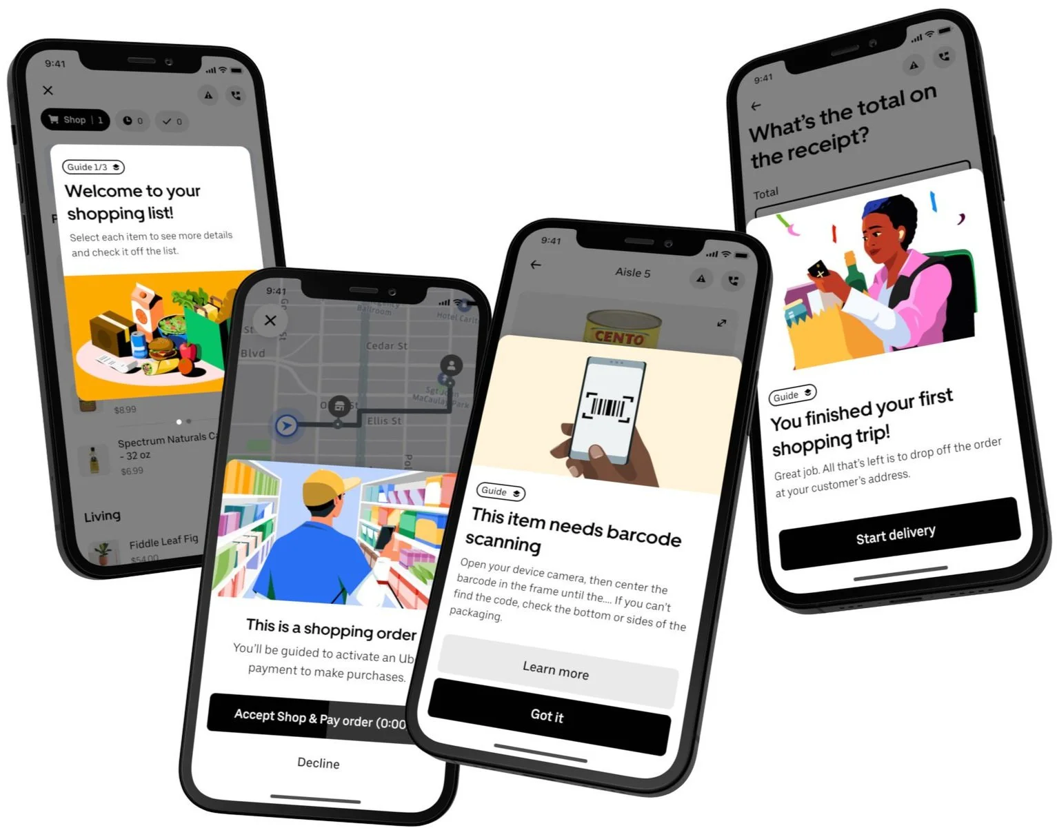
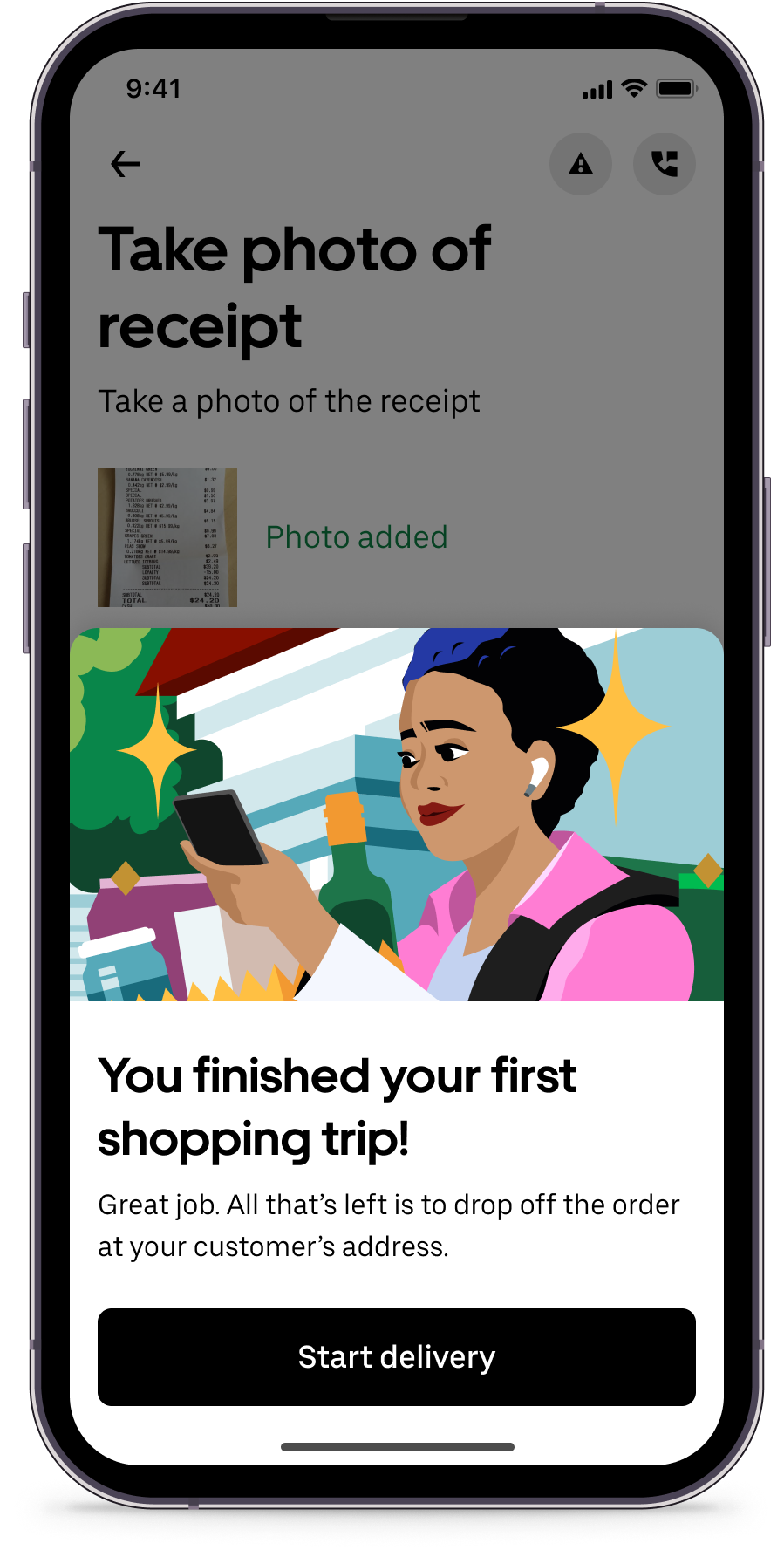
An educational flow leads users through their first shopping trip while building confidence and trust.

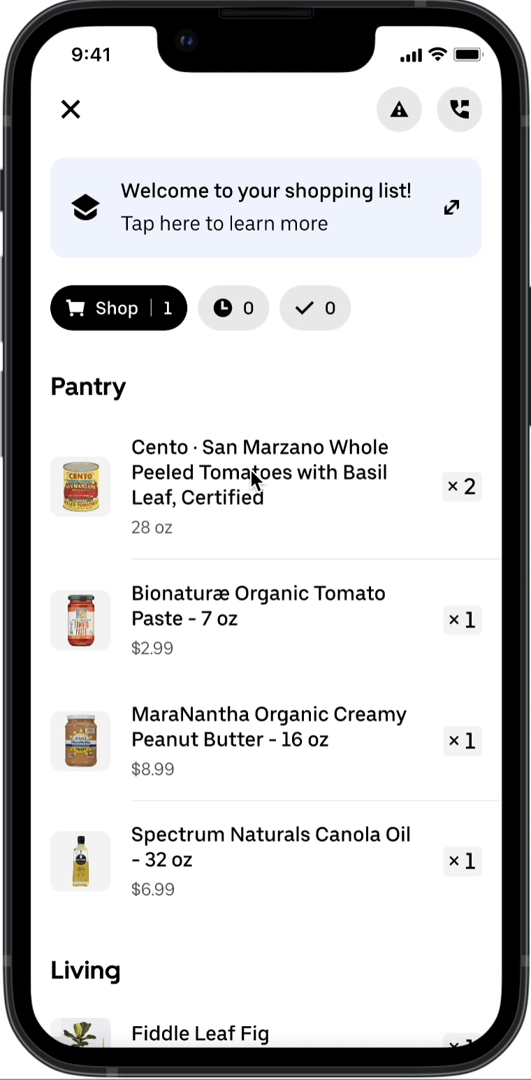
Coherent & predictable framework of components
Guiding tips and context provided at relevant points in the trip
Strategic use of motion design and content for accessibility
A positive first experience improves user retention
The current experience saw many users abandoning the process during their first order, or not returning after their first experience.
User Churn
Contractors accept grocery orders through the Uber app, shop for items in-store, and deliver the order to the consumer.
These shoppers are confused and overwhelmed by the complex process to complete their first order. Shoppers who fail to complete their first trip are 200% more likely to drop off the platform.
Business Risk
High consumer demand, paired with low shopper supply, leads to long wait times and high cancellation rates for consumers.
I analyzed the user journey and identified key moments for intervention.


I utilized existing research, metrics of time spent on each screen, interviews, and user testing to understand where the shoppers become confused, overwhelmed, or unsure how to proceed.

I developed a framework of structured, repeatable patterns for how and when to surface interventions, and design principles to guide the process.

Interplay between digital and physical worlds:
Create in-app flows that support user interactions in the physical world.
1
2
Support user expertise and independence:
Help users develop knowledge, while allowing them to make decisions from their existing experience.
Manage overload through progressive disclosure:
Surface content applicable to the moment at hand, and avoid overloading with non-relevant information.
3
I developed prototypes to test the end-to-end user journey - and discovered some key flaws.
Information Overload!
Too many pop-ups = excessive cognitive load

Key lesson: good design includes restraint!

Fewer popups; headings, short phrases, and clear images.
Simplifying the Experience
Key Lessons: Simple, Accessible, and Effective


Focus on What’s Most Important

We reduced the content as much as possible, to avoid cognitive overload in an already complex physical and digital experience.

Designs are Repeated and Predictable
The framework is coherent, feasible for engineering, and can be scaled larger or smaller across use cases.
Accessible Content
Educational content is supportive and timely. Lessons can be practiced right away.
1
Reduce Overload
To balance in-app content with outside stimuli, interventions are at a minimum.
2
Effective Interventions
By improving early experiences, shoppers will be more likely to remain on the platform and complete more orders.
3
Building exemplary prototypes can showcase the experience to leadership and cross-functional partners, so that we can build this vision in alignment.
Let’s make it feel real.